|
According to M. Butterick, "Typography is the visual component of the written word." Typography is important as people are inclined to pay more attention to a poster or design that is more visually pleasing than things that aren't. It also reinforces the definition of the word itself, so it makes life easier. The quote, "Each font has a personality and a purpose," means that again, fonts reinforces the definition fo certain words. For example, Comic Sans, is a playful font. However, when people have bad graphic design skills, they may use playful fonts like Comic Sans for serious situations such as danger signs. This makes it very confusing, so again this shows how typography is important. In class, we learned about the five different types of fonts. The first one is serif, which has "feet." It is often used in large blocks of text and print. The second one is san-serif and unlike serif, it doesn't have "feet." It is often used for headlines, titles, and smaller chunks of text. Also, it is used for the web. The third one is monospace where each letter takes up the same amount of space. It is used in coding. The fourth one is script or handwritten which is cursive, calligraphic, or handwritten. It is sometimes hard to read but is used for logos, large headlines, and details. The last type of font is novelty which are good attention-getters and popularity comes and goes. It is used sparingly. Typeface ComparisonIn this assignment, we had to write five words with different font types such as serif, san serif, monospaced, script, and display. We used the same text as an example, and I used my name. We had to align and space all the words carefully, so that it looked pleasing. In addition, we had to choose different colors to create contrast. I learned how to differentiate between different fonts and their unique attributes. 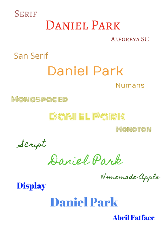 Word PortraitsIn this assignment, we had to use 10 different fonts to show that every font has a meaning that can give more meaning to text. I had to made sure the names of the fonts were all the same size, and that the words were aligned with each other, so it was aesthetically pleasing. It was very interesting to see how some fonts may be appropriate to some text, and completely random when used with other text. 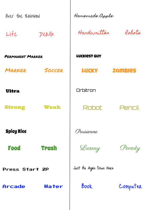
0 Comments
Leave a Reply. |
Archives
May 2019
Categories
All
 This work is licensed under a Creative Commons Attribution-NonCommercial-NoDerivatives 4.0 International License. |
