|
In this assignment, we were asked to create 3 different logos and vectorize them using the pen tool provided from Gravit.io. Then, we had to create three different variations of these logos. The most challenging part of this assignment was vectorizing the logos as you had to be very precise and neat. My favorite part of this assignment was actually making the different variations and trying out different color schemes. From this whole experience, I learned how to insert handwritten things online through vectorizing and scanning. 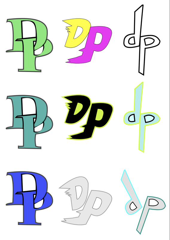 Out of all these logos, I chose this one. This logo is about myself, as it includes my initials. I wanted to create a logo for myself to use for this blog. I wanted to create a logo that represented me. Some things about me that wanted to be represented was how I was creative, athletic, and a problem-solver. This logo accurately represents these traits as it is creative and has a sporty look. In addition, it was a hard process to create this, showing how I am a problem-solver. Another thing I think was important was choosing the right color scheme to fit this sporty logo. This was my favorite as I like the color scheme and again the fact that it represents me. 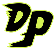
0 Comments
Leave a Reply. |
Archives
May 2019
Categories
All
 This work is licensed under a Creative Commons Attribution-NonCommercial-NoDerivatives 4.0 International License. |
