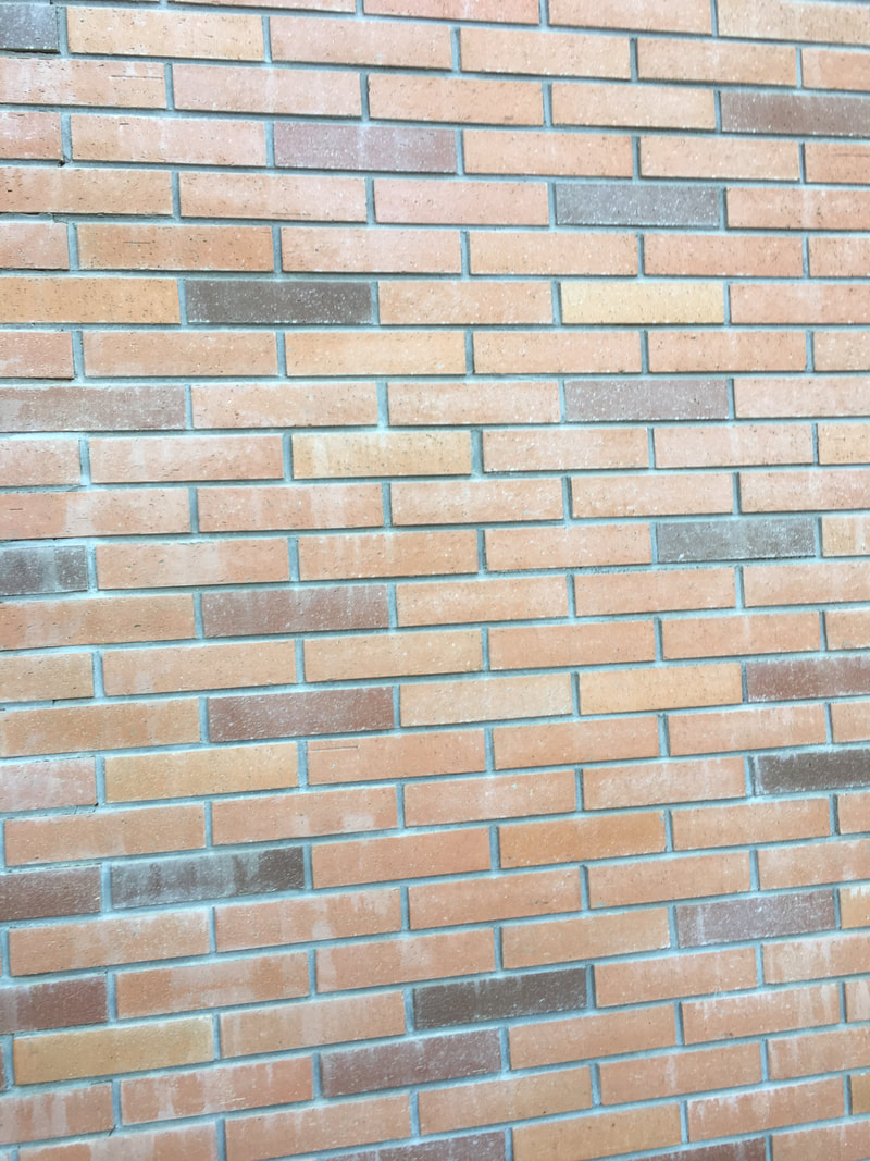
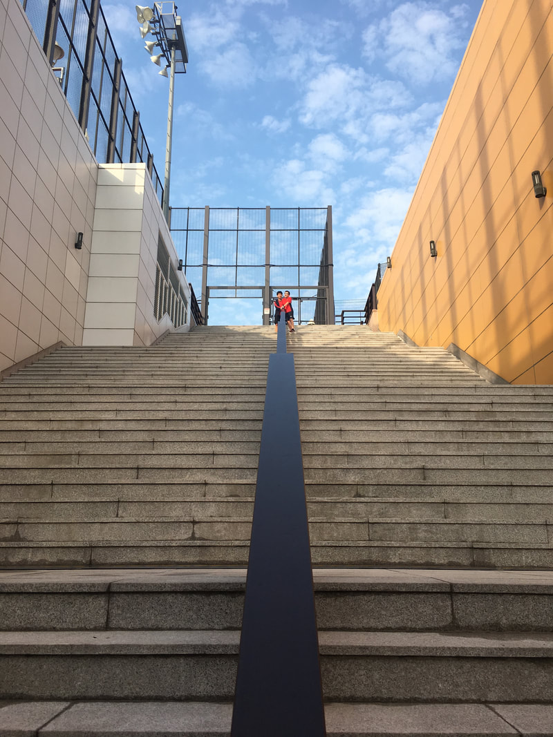
           Leading Lines- In this picture, I was asked to take a photo of leading lines that can direct the viewer to the focal point. I like how the image is symmetrical, and the railing is leading the viewer to the people at the top. However, I dislike how hard it is to see the focal point as it is so far away. So, next time, I can improve by trying to make the focal point clearer by moving closer to it. 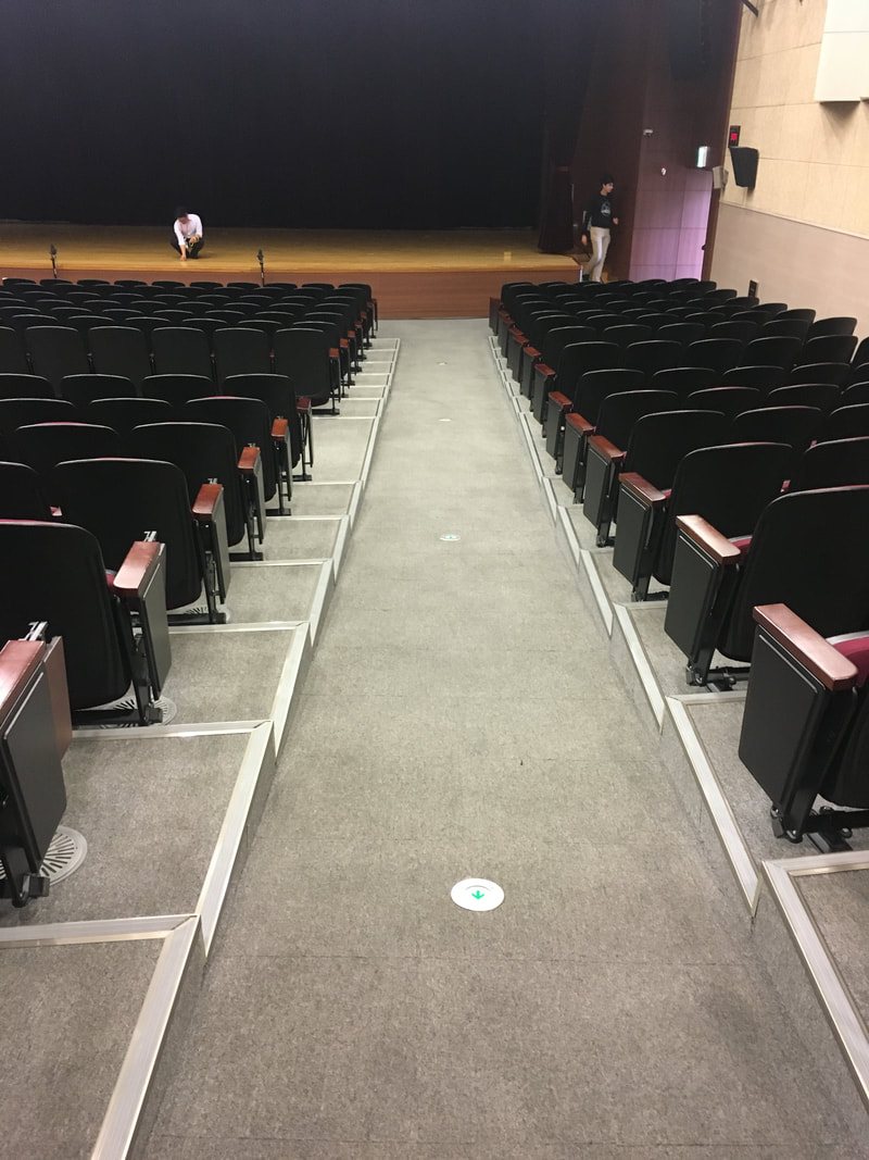 Converging Parallel Lines- In this picture, I was asked to take a picture of converging parallel lines that helped create depth in the image. I liked how the picture accurately showed this, and how it was nicely framed. However, I dislike the people in the background, that distracts the viewer. Something I can do better next time is to spend more time when taking a photo, to make sure there isn't any clashing elements in the picture. 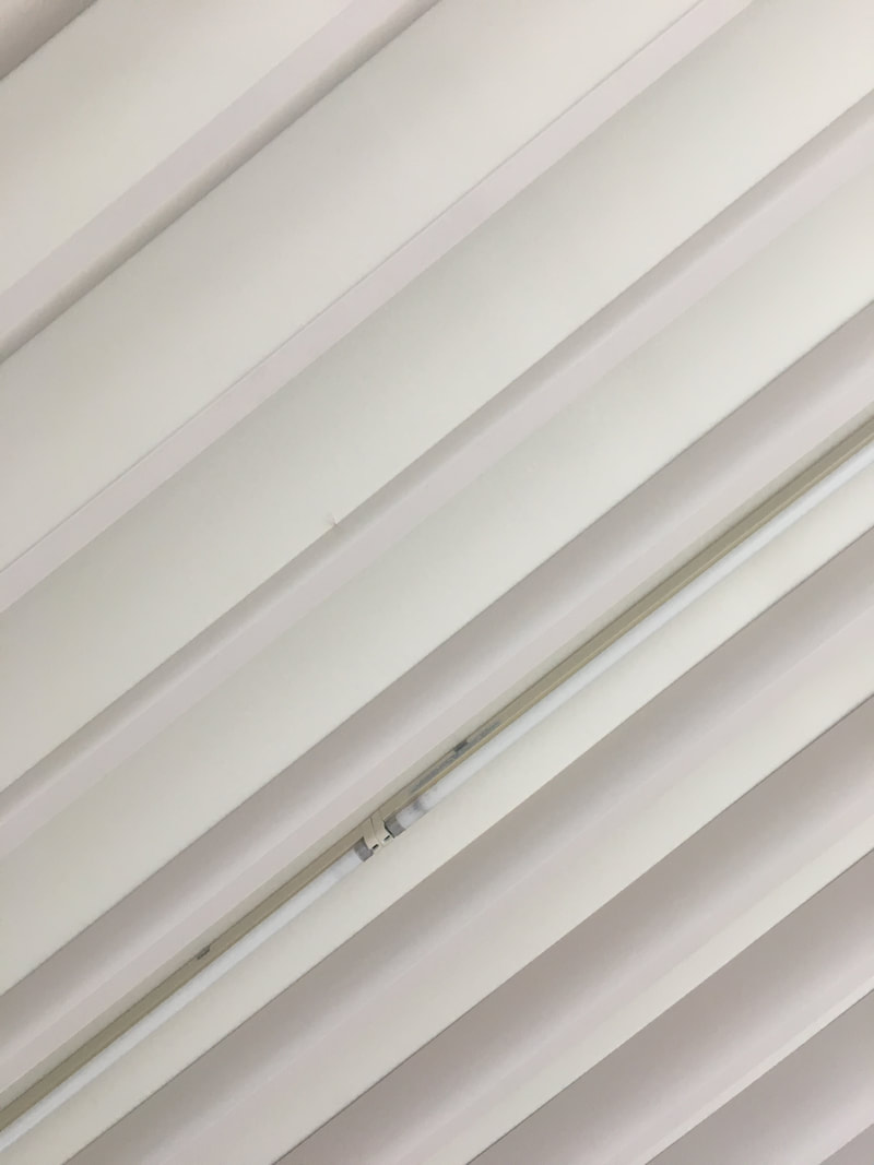 Diagonal Lines- In this picture, I was asked to take a picture of diagonal lines that convey movement. I liked the simple color scheme of this wall, and how I tilted my reference point to turn the vertical lines into diagonal lines. However, I dislike the part of the wall I took as the lights were showing, which makes it look less aesthetically pleasing. Something I can do better next time is to take more time choosing wisely which part of my subject I want to take a picture of. 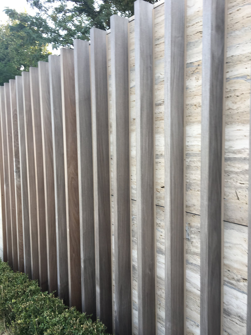 Vertical Lines- I had to take a photo that had strong vertical lines. They were wooden poles that were parallel to each other, going vertically. I like the design of this wall and how it is simplistic, while also conveying vertical lines. However, I don't really like the angle I took this photo because it makes the wall seem not even. Getting the correct angle for this picture was challenging, and I can try different angles next time to improve. 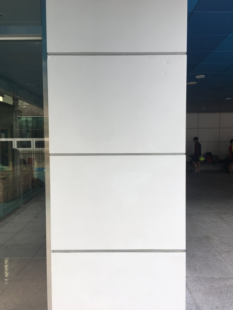 Horizontal Lines- In this picture, I was asked to take a photo of horizontal lines that would have a calming affect on the viewer. I like how simple the picture is, clearly demonstrating horizontal lines. However, I dislike how you can see other things in the background that takes away attention from the focal point. Next time, I can try blurring out the background or even editing it out to make the focal point clearer and not have any clashing elements in the picture. 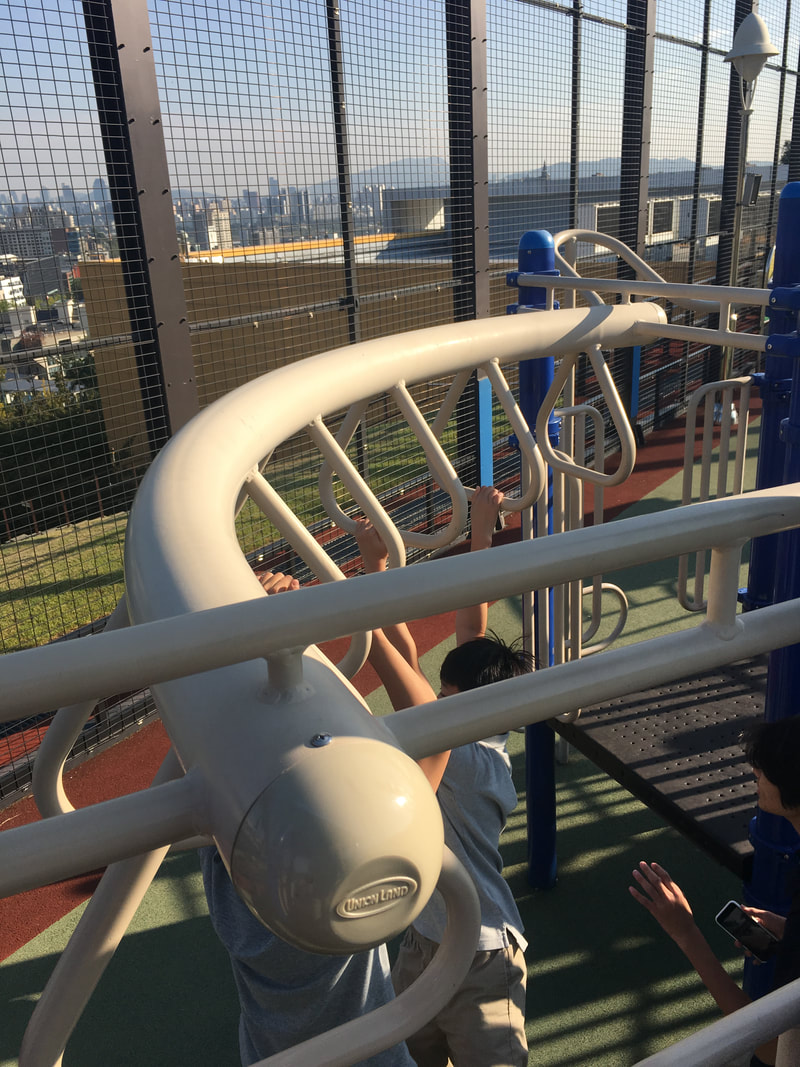 Curved Lines- In this photo, I was asked to take a photo of curved lines that showed gracefulness. I like the different colors and the people on the monkey bars, which adds an element of style into the picture. I don't like how close the picture was taken, and because the playground was restricting, I had a hard time taking a good photo that wasn't too close or too far. I could improve next time by trying different angles and reference points when taking pictures.
 JAMES HAMMETT Leading Lines  AYA O Diagonal Lines  STEPHANIE HOHMANN Curved Lines  JOSH NAMDAR Converging Parallel Lines  TUẤN NGUYỄN Horizontal Lines  JOHN HARPER Vertical Lines
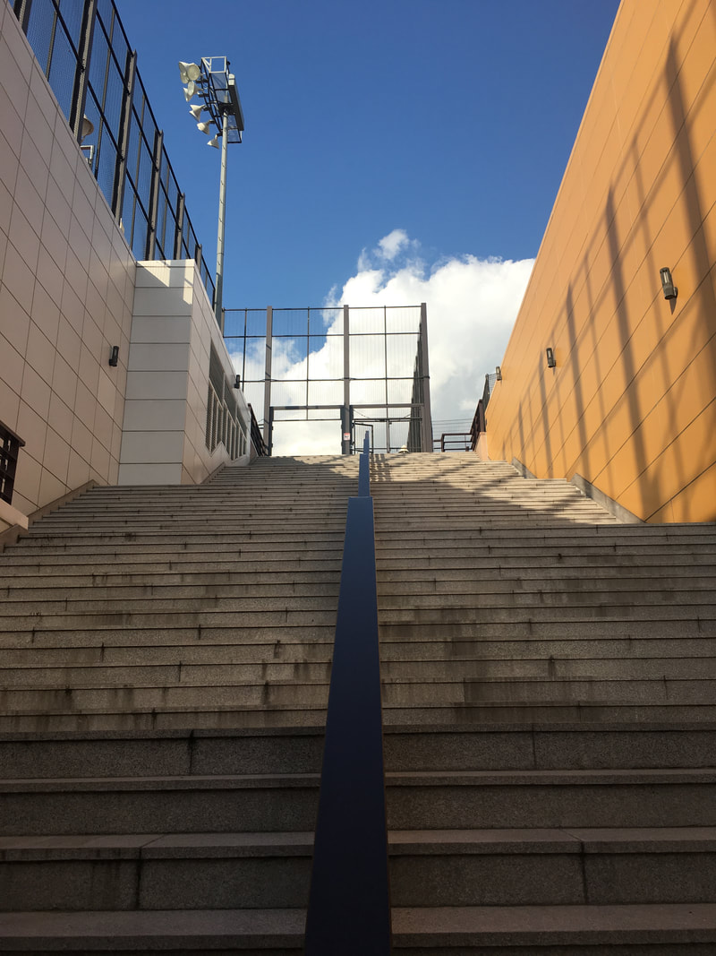 This is a picture of stairs, separated by a railing. This is symmetrical as the staircases line up, with the railing dividing them.  This is a picture of the spider web climbing net on the playground. This is symmetric, with both sides lining up and being basically identical to each other. 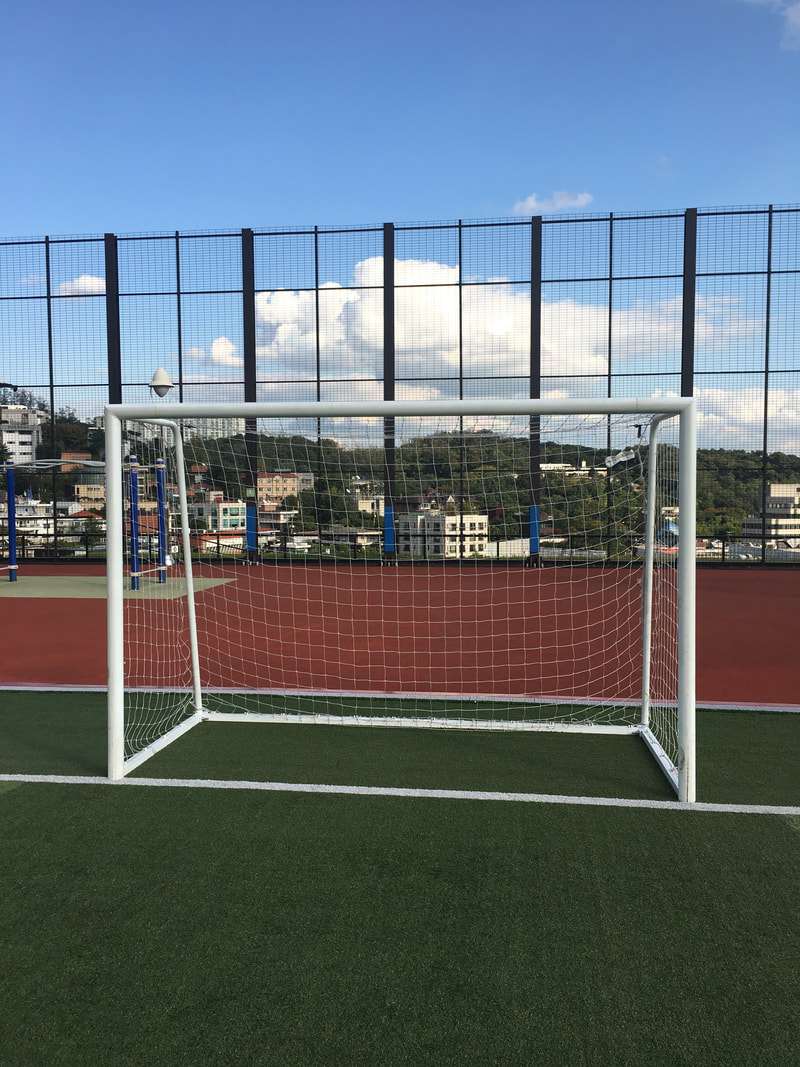 This is a picture of the goal post, and it is very symmetrical, able to evenly divide it into two different parts. 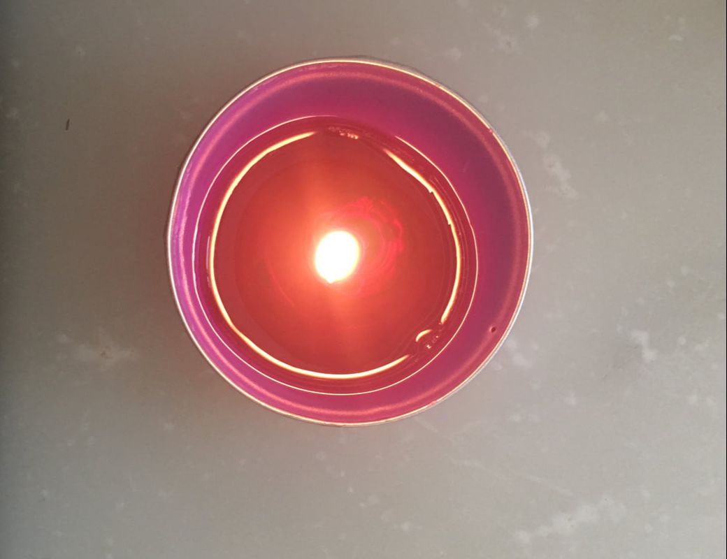 This is a picture of a candle, that is symmetrical. The candle wick shows the center of the candle, and the two even sides that are identical to each other. 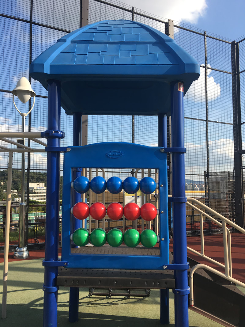 This is a picture of the playground. It is symmetric, not considering the stairs. Even the colored balls line up, with the same color.
In this assignment, we were asked to take two sets of pictures of three different clear focal points, one picture following the rule of thirds, and one that is not. Then, we were supposed to write which picture we preferred more- the one that is following rule of thirds, or the one that isn't. In this lesson, I learned about the rule of thirds, a method in photography that uses a 3x3 grid to help align focal points on the vertical and horizontal lines to appear more pleasing to the eye. In some cases, in helps the focal point stand out and seem more balanced. However, in other cases, it doesn't look good. But still, it is a very useful principle that I will be continuing to use when taking pictures. I prefer the image on the left (Not following rule of thirds) I prefer the image on the left (Not following rule of thirds) I prefer the image on the right (Following rule of thirds)
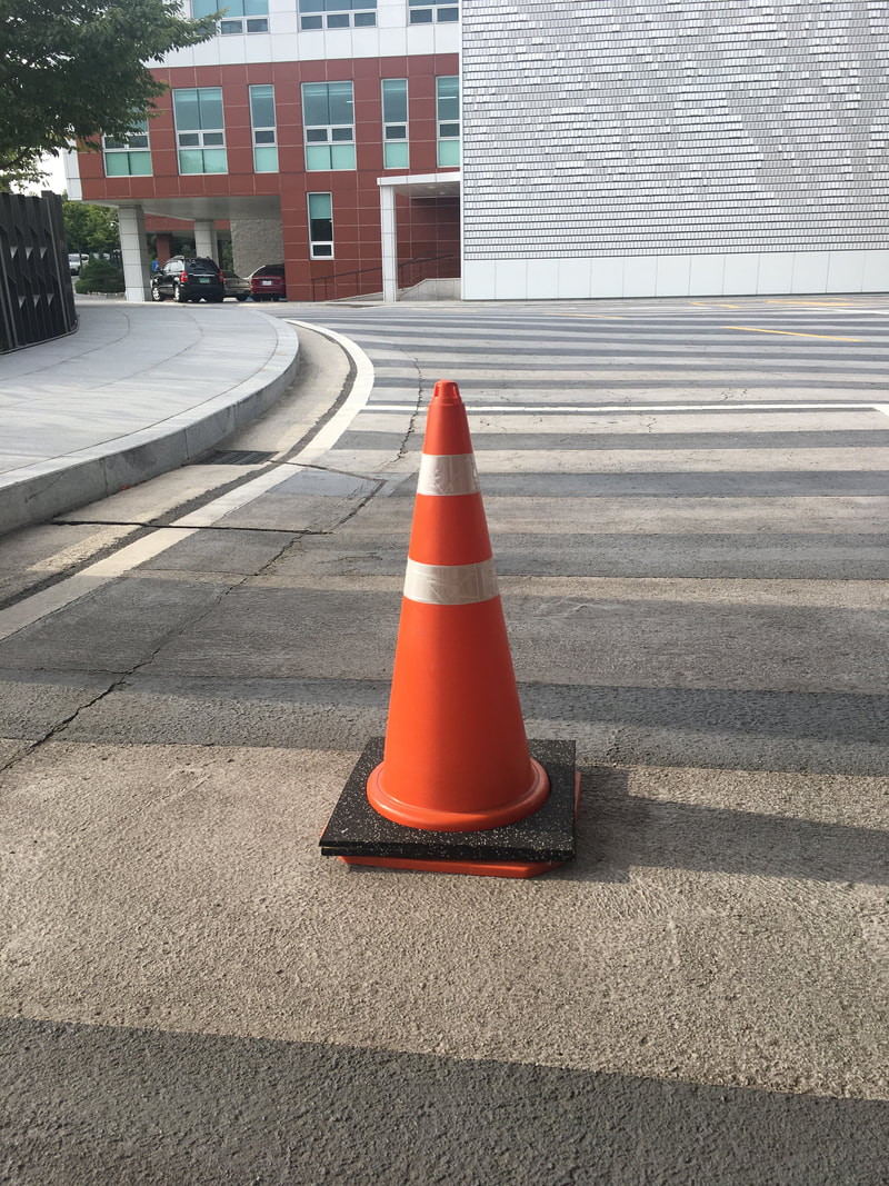
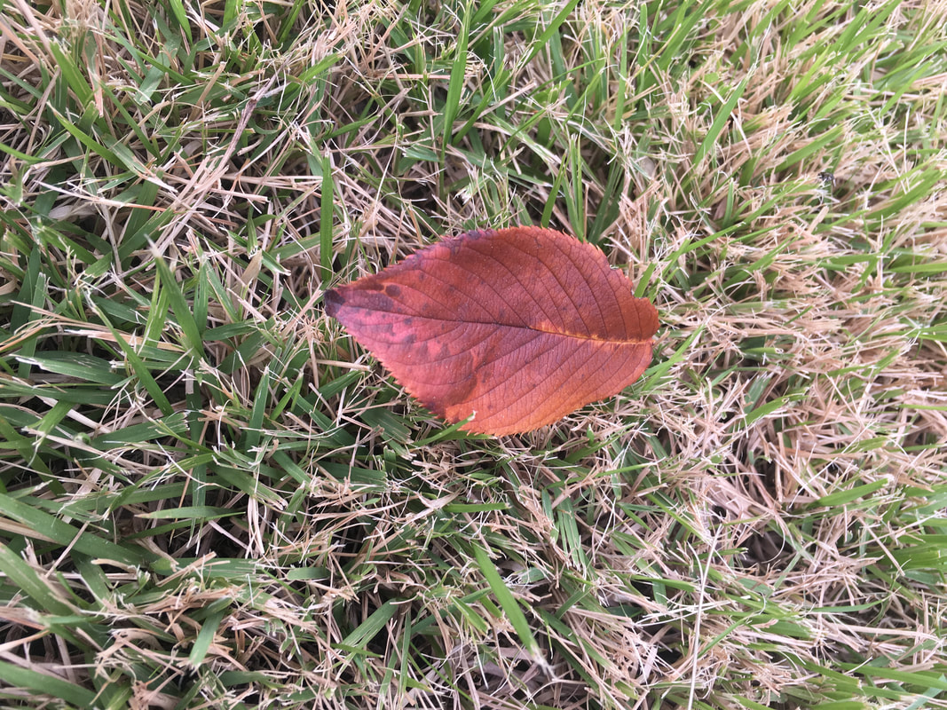
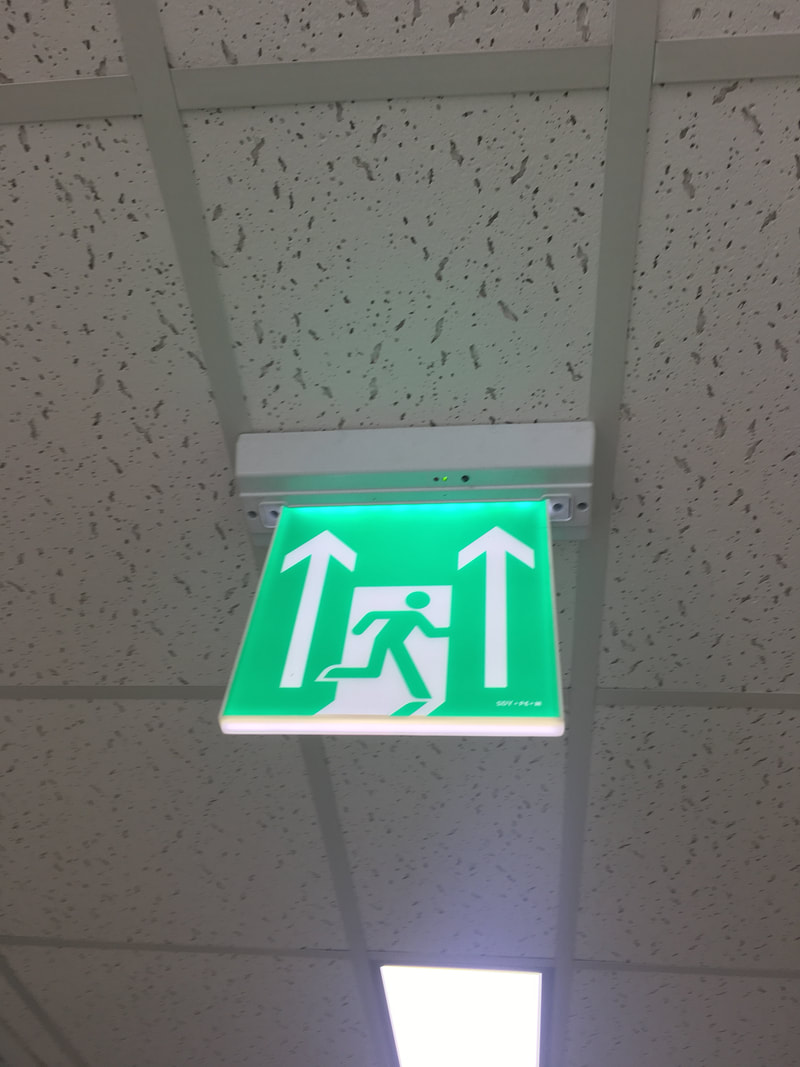
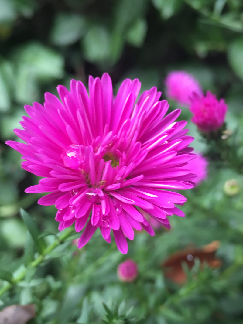
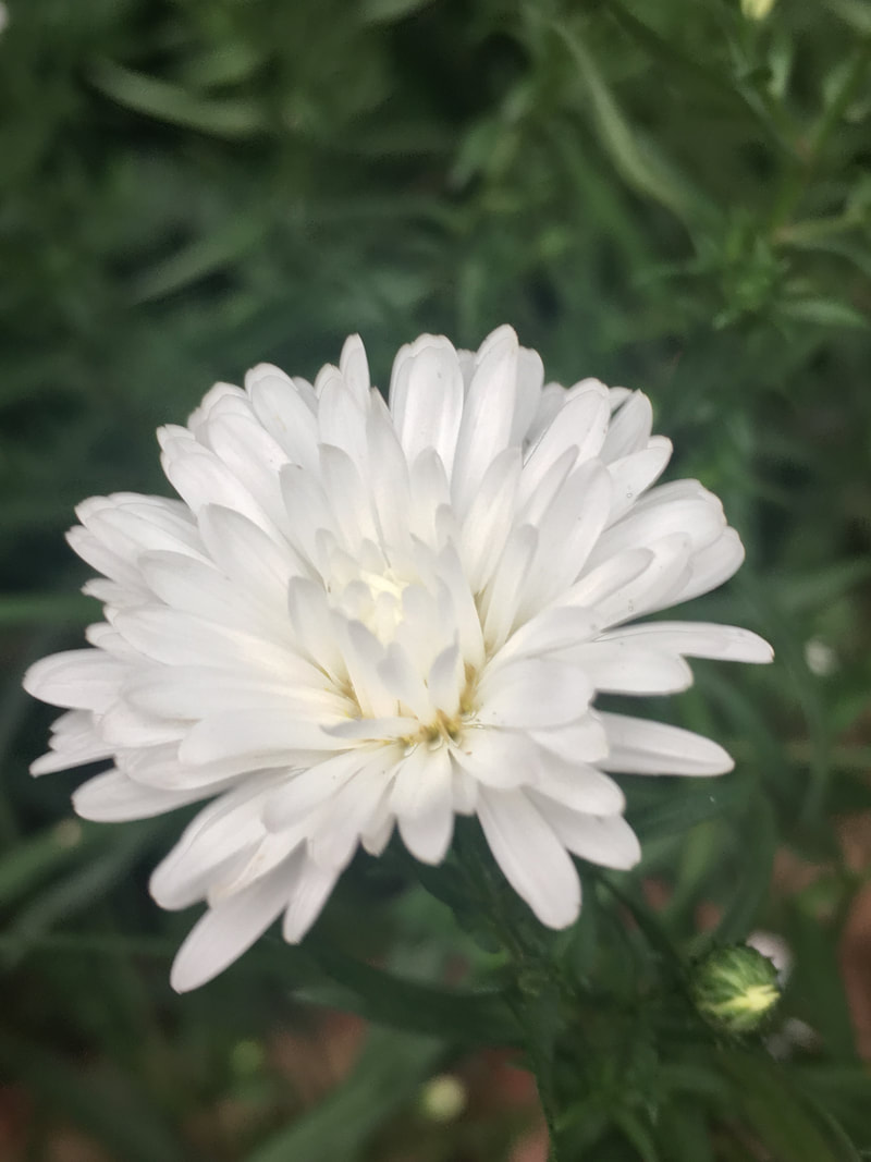
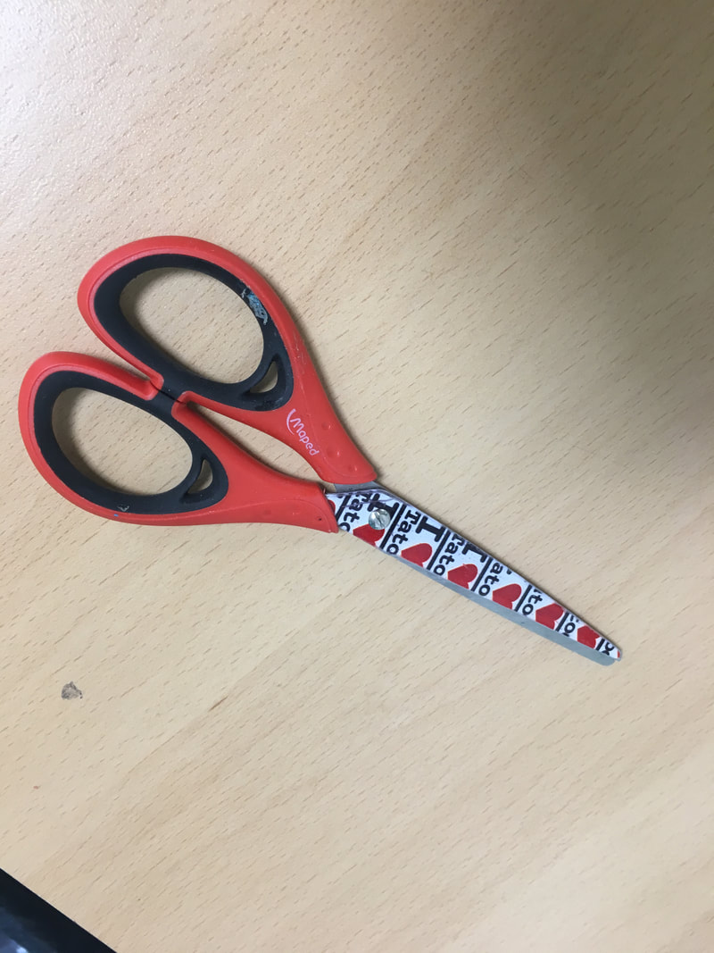
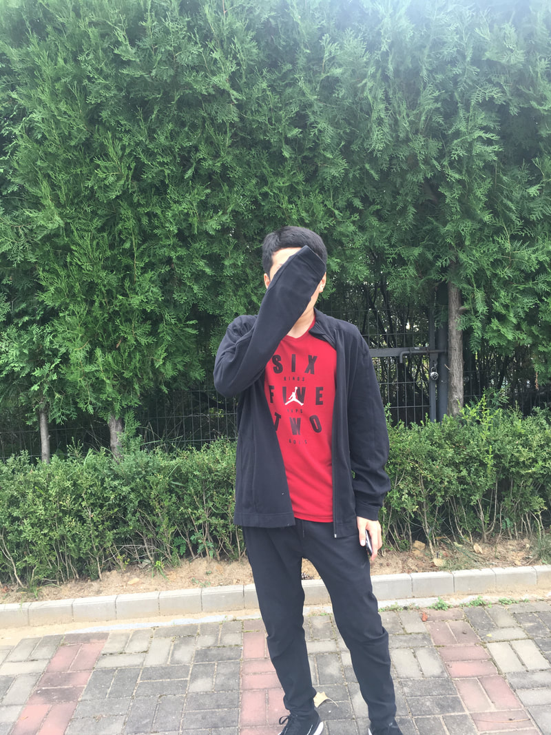
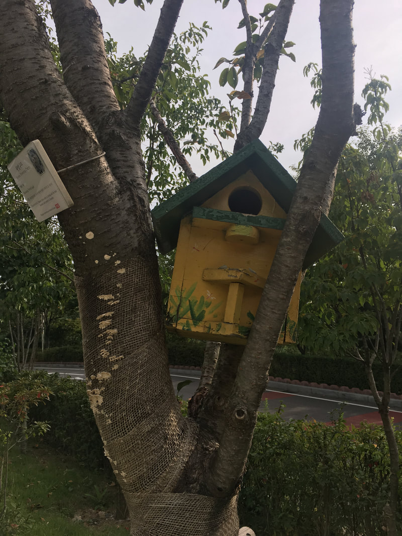
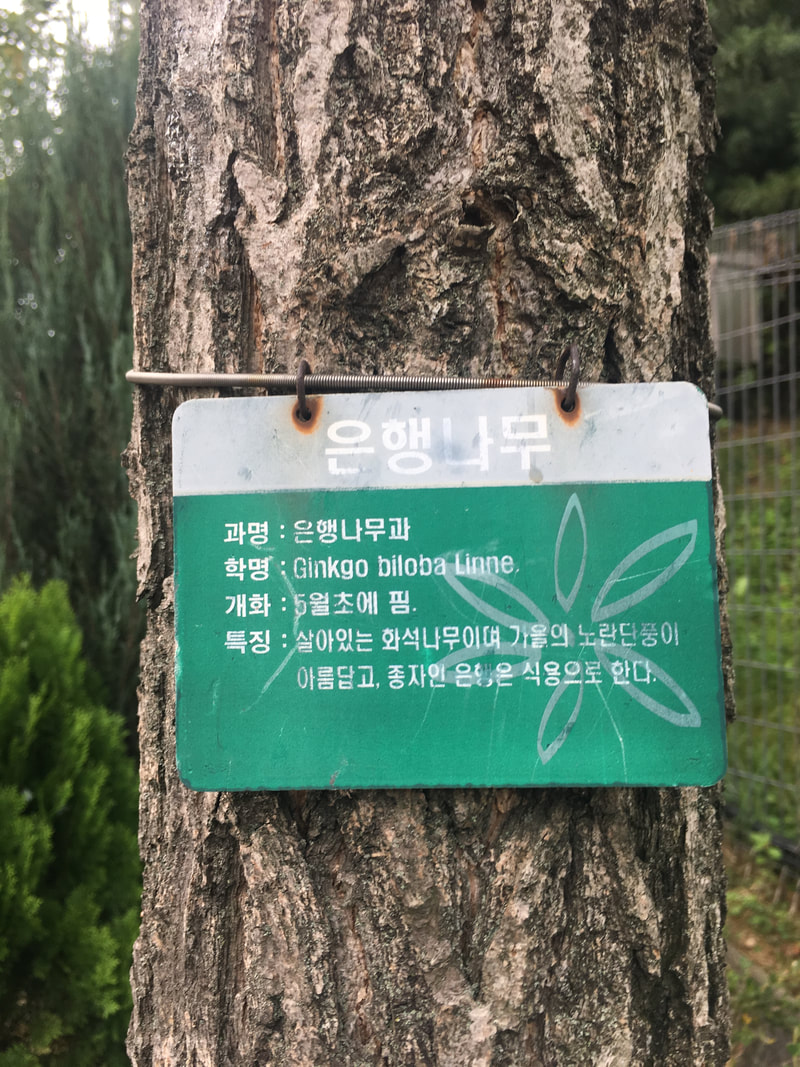
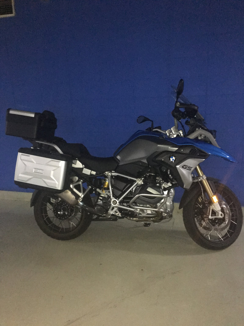
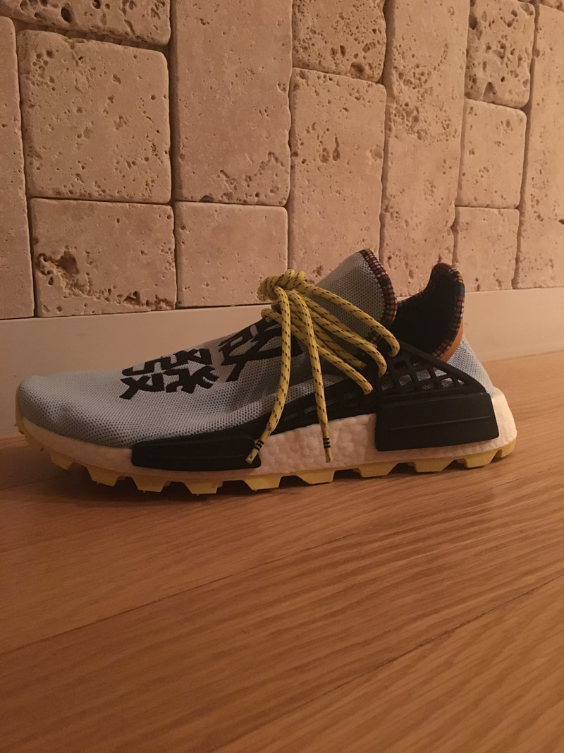
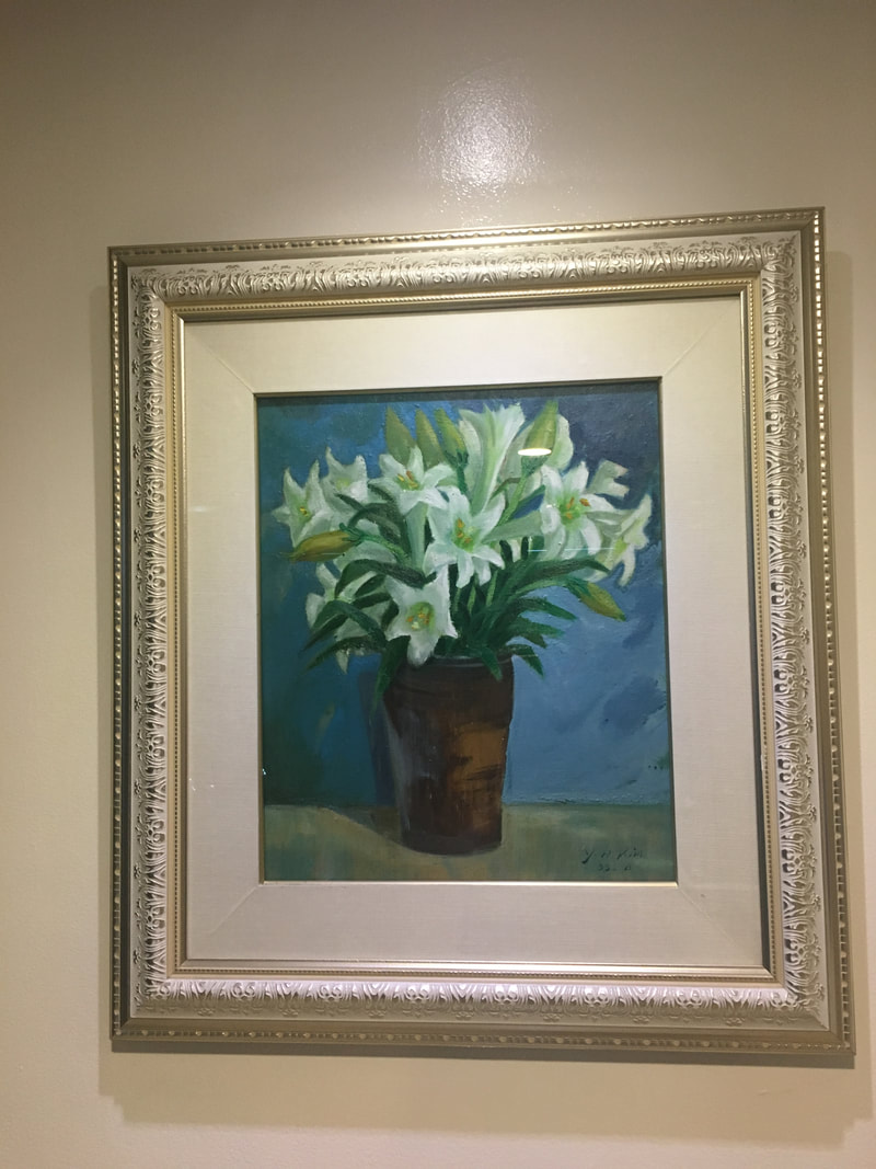
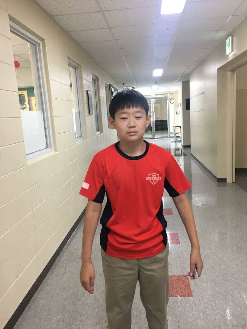
          My favorite photo is the picture of the cone, as it is very simple, while having a clear focal point. In addition, the background doesn't steal the attention, but rather blends in nicely with the cone. The most challenging part of this activity was finding an interesting focal point, and making sure there isn't any other objects in the picture clashing with this. From this activity, I learned the importance of having a clear focal point, and how to use the background to complement the main focal point. Focal Point- Traffic Cone, Leaf, and Exit Sign Focal Point- Light Post, Purple Flower, White Flower Focal Point- Scissor, Kadyn, Birdbox Focal Point- Sign, Motorcycle, Shoe Focal Point- Painting, David, Ice Cream
|
Archives
May 2019
Categories
All
 This work is licensed under a Creative Commons Attribution-NonCommercial-NoDerivatives 4.0 International License. |